via examiner.com
Buckminster Fuller and Olafur Eliasson Exhibition
 Recently I had the good fortune to see the Buckminster Fuller exhibit while visiting Chicago. He was one of the first interdisciplinary thinkers and an early advocate of alternative energy. This is an excellent exhibit for those who want to be inspired by a true visionary. He was an architect, engineer, environmental scientist, mathematician, philosopher and visual artist. One can explore his quest to discover what one person can do to serve the needs of his fellow human beings. Olafur Eliasson’s work is concurrently showing until September 13, 2009.The Buckminster Fuller exhibit is showing at the Contemporary Museum of Art in Chicago, extended until July 5, 2009.
Food for Thought: Continuing the Discussion on “Creating A Sustainable Public Art Practice”
Panelists Christine Baeumler, Seitu Jones, Nicholas Legerous, and Ralph Nelson of Loom Studio shared their recent projects as well as views on the latest concerns and trends in sustainable public art practices (including the desire for a word to replace sustainable!). An inquisitive group of students from Vesper College and a hearty group of Twin Cities based public artists spurred the discussion along.
Forecast collaborated with NEMAA, Vesper College, and The Institute for Advanced Study at the University of Minnesota to host the evening to celebrate and promote the newest issue of Public Art Review which focuses on the same theme.
As is always the case with good dialog many more questions were raised than answers given. Forecast collected written questions from the audience and encourages you to continue the discussion online. Feel free to add your thoughts to the questions posed below! Or just read them as food for thought.
Does the future of sustainable art making lie in the manipulation of living organisms as a medium – moving away from the static?
How can (public) art inspire “mainstream” America to act?- Brad Baso
What change needs to occur within (public) art as a practice in order to be even more sustainable? What is holding the field back? – Brad Baso
Where can one learn more about reusing water on one’s own property? Do you know of any city funded programs to encourage property owners to set up these types of projects? (related to a discussion on watershed art projects).
What are the negative & positive effects of the current economic downturn on sustainable public art & artists? – Laurie Phillips
Sustainability demands scientific, technical knowledge of creative professionals. Will “Sustainability” in art eventually lead us to merge the studio with the laboratory (or field studies) in a seamless synthesis? Where might this lead?
Nick differentiated between his world before and after being involved in a community. Could everyone comment on their experience working as part of a greater community? – Susannah
Please speak a bit more to how initiatives, community collaborations, and community history can become a part of sustainability.
How can public art be utilized better, especially concerning business as usual? Do you think art can help to change people value systems and help to work for social change?
How do beauty and emotion (of the work and process) help to build community and a better world?
When you envision a project that cuts across disciplines and public entities, is it best to approach them separately or together?
What skills, experiences, and insights do aritsts contribute to the sustainability community of scientists, government business, etc? Why should they be at the table? – Brad Baso
Does public art create change within or in spite of the system? – Brad Baso
What is being sustained in sustainability? – Jon Spayde
“Sustainability” – overused indeed, so what buzz word should we start using instead?
How do you break into public art “creating sense of place” when pigeon-holed by commercial sense of place?
How do you get started in public art if your background is in commercial art but your heart is public?
“See also” call for entries

See Also is an annual program of the Cleveland Public Library in partnership with Cleveland Public Art that invites artists, designers, and other creative professionals to create temporary public art projects in the Eastman Reading Garden. The program commissions innovative, thought-provoking works of art that add to the Library’s already broad range of educational and cultural programming. Each year, one artist or team of artists is selected to exhibit an installation from May until October in this highly visible and beloved space.
A Manifesto for Public Art

Cameron Cartiere and Sophie Hope, researchers on public art from Birbeck College, University of London, have developed a Building Cultures wiki, including A Manifesto of Possibilities: Commissioning Public Art in the Urban Environment, for which they are requsting input, writing:
“Increasingly, people working in diverse aspects of contemporary urban society, from developers to park wardens, are turning to the arts for new ideas, regeneration, problem solving and community bridge building. The employment of artists in these (traditionally non-cultural) fields, where there are other non-art issues and agendas at stake, is becoming the norm. This manifesto is a chance for you to address the uncertainties of commissioning art in areas of urban change, discuss crucial concerns, and devise tangible solutions, knowing they will be presented to key decision makers.”
The manifesto includes thoughtfully pragmatic advice for all parties in the process of commissioning, creating, producing, and presenting art in and for the public sphere and is divided into six sections:
- The Commissioning Process
- The Artist
- The Curator
- The Community
- The Art
- The Evaluation
The wiki also incluses a list of resources and links to other manifestos, such as Mierle Laderman Ukeles’ 1969 “Maintenance Art—Proposal for an Exhibition. [pdf]
The introduction to the project and manifesto is here. Add your experiences and opinions to the wiki here (registration required).
via Marking Place
Join the Gratitude Guerilla Action Walk on May 24th!
Gratitude Guerilla Action is a walking “Thank-Youâ€Â being performed in various cities as a simple, non-dogmatic gesture of gratitude and a reminder of our collective good fortune. An elegant iridescent balloon with the words “thank-you†printed in white is carried by participating walkers as they experience the sublime peacefulness that results from giving gratitude to no one in particular.
Lead by artist Krista Kelly Walsh with start up support from Forecast Public Art, the Gratitude Guerillas have taken 762.2 steps, given away 900 balloons, and hosted 64 walks in four cities!
I was lucky enough to participate in one of these walks last summer. It was dusk and it had been raining all day with the clouds clearing just long enough to form a striking sunset to reflecting the slick sidewalks. I will admit public performance art is not always something I am comfortable with but after a few moments if felt more like meditative practice than an attention grabbing gesture. It was truly amazing how just the tiniest bit of consciousness of gratitude for the world around you grows into an overabundant rush of appreciation for all that we take for granted in our everyday lives.
If you are in the twin Cities metro area I encourage you to take the time to walk with Krista. This will be the first of two actions that are planned for 2009. In the spring , a “thank-you” Balloon Give-a-Way on Como Lake in St. Paul and A Sunset Walk on Raspberry Island
MAY 24TH 4-7PM COMO LAKE ST. PAUL, MN
(Rain date MAY 25TH 4-7PM)
see the web site for further information and weather updates:Â http://www.gratitudeguerilla.webs.com/
Jackrabbit Homestead
From Kim Stringfellow.
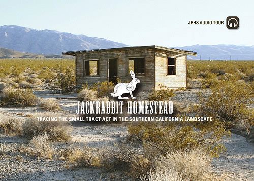
Jackrabbit Homestead is a web-based multimedia presentation featuring a downloadable car audio tour exploring the cultural legacy of the Small Tract Act in Southern California’s Morongo Basin region near Joshua Tree National Park. Stories from this underrepresented regional history are told through the voices of local residents, historians, and area artists—many of whom reside in reclaimed historic cabins and use the structures as inspiration for their creative work.
To experience the project, please visit http://www.jackrabbithomestead.com.
Funding for this project is made possible, in part, by a grant from the California Council for the Humanities as part of the Council’s statewide California Stories Initiative. The Council is an independent non-profit organization and a state affiliate of the National Endowment for the Humanities. For more information on the Council and the California Stories Initiative, visit http://www.californiastories.org.
Beautiful Light
FOUR LETTER WORD MACHINE – 2009 Scottsdale
Forecast ran across this project while researching for its upcoming issue of Public Art Review on innovative technologies in public art.
A detailed description of the project can be found at D.A. Therrien’s web site beautifullight.org and here is a brief overview.
“FOUR LETTER WORD MACHINE displays either 4 letter words in standard Roman alphabet or up to 4 billion+ word combinations as a graphic digital display device. It is essentially an entropy machine – it is designed to break, a product of unnecessary complexity.
The display itself is designed as a 30 meter high x 150 meter wide array of linear quartz lamps, 3,500,000 watts total power. The first full installation will be on a cliff face in the Northern Arizona desert (a 10% scale model is currently under construction for use in smaller venues.)
The human body and mind are integral to the control system, essentially a 64 channel mechanical relay control that is both state of the art and archaic in design. A computer reads from a “book” and passes instructions to 4 bodies (performers) in rotating cages (actually large drum type
switches), who in turn pass information to 32 bodies via an eye tracking system.
Also on the Beautiful Light website Therrien talks about the piece.
Installations in the BEAUTIFUL LIGHT series are derived from ideas that I have been fascinated with since childhood, most specifically, the phenomema of light and electricity and the role of light in our belief systems, language, biology, natural world and cosmology – light as illumination, energy, information – and as a metaphor for good and evil. It is also one of our earliest technologies – fire to drive out the night.
The term “Beautiful Light” is double edged, describing both the observable physical nature of pure light and representations in various belief systems and cultures – Egyptian, Greek, Judaism, and later, Christianity. In Egyptian mythology, the god Taht (Apollo in Greek) was represented as a “beautiful light” and this light represented knowledge itself. In the Bible, angels are described as beings of light – messengers of light.
In addition to my interest in light and electricity, I have a fascination with language and the codes that represent it, both analog and digital. The 4 LETTER WORD MACHINE, the first installation in the BEAUTIFUL LIGHT series, explores the purity of white light, the mystery of language, the precision of digital codes and the magic of 4 letters – A, C, G, T – representing the DNA code, and consequently, all known life.”
What’s up in Milwaukee?
On April 1, Mary Louise Schmacher wrote an article in the Milwaukee Wisconsin Journal Sentinel titled “Why Milwaukee is ready for Zweig’s public art.” She begins the article:
“Here’s hoping Milwaukee has finally found a public art project that it can embrace. Janet Zweig’s proposal for E. Wisconsin Ave., which goes before the Common Council’s Public Works Committee this morning at 9 a.m. is a quiet, poetic work that will delight and surprise pedestrians.
“Zweig defines the term ‘public’ in ‘public art’ in entirely new and truly meaningful ways. Instead of creating committees that get nominal community “input”, that have token artists offer opinions before commissioning static works of forgettable art, as has been done repeatedly here, Zweig’s art engages Milwaukee in a thoughtful and genuine way.”
Read the full article.
Later that same day, Schumacher blogged: “Janet Zweig’s public art project in trouble.” In detailing what happened at the meeting of the Public Works Committee of the Common Council, Schumacher quoted some of the responses at the meeting.
“Ald. Robert G. Donovan left the room, saying, ‘I refuse to have my name attached to something as ridiculous as that.’
“Aldermen Joe Dudzik and Willie C. Wade also objected to the ‘old school’ technology, signs similar to those used in train stations until a few decades ago, which would be used to make animations.”
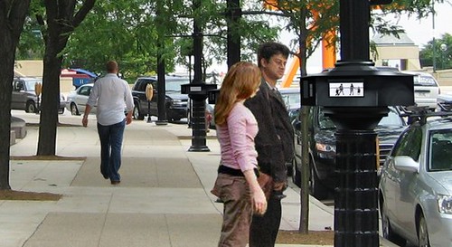
Prototype of Zweig’s proposed project.
Dudzik and Wade said, according to Schumacher in a related article:
“‘We are taking about a design that holds us back or indicates that we are stuck in the past,’ said vice chairman Ald. Joe Dudzik, referring to the old-fashioned signs that Zweig uses to create short animations.
“‘I am just not feeling it,’ said Ald. Willie Wade. ‘But then I wouldn’t pay 50 cents for the Mona Lisa.'”
I’m not familiar with the situation on the ground, and it’s hard to imagine why a 3-year, $300,000 project appears to have caught the Council by suprise with only one speaker in support of the proposal. Nevertheless, I’m a fan of both Zweig’s work and the “old-fashioned” technology she proposes to use – wonderfully, I think.

When I first saw Zweig’s Impersonator – not in person, unfortunately – I was captivated. The flip technology is best known for its use in transportation hubs, such as train stations and airports, and it is this association that makes it like a sign post for the imagination. What if I was going to Lille today? Where exactly is Strasbourg? How long would it take to get out of town to Chicago?
Janet Zweig, Professor Obsessive and His Two Compulsions from Steve Dietz on Vimeo.
In Milwaukee, Zweig is proposing a series of animations using the flip signs, as in the example above. I think it’s interesting that the council members apparently complained about the low tech nature of this proposal. For me, it is evocative of the invention of cinema with devices such as the zoetrope and conjures an entire cinema paradiso of imaginative pleasure. When ZER01 presented Peter Hudson’s Homouroboros zoetrope at the 2nd 01SJ Biennial, no one complained about how low tech it was. It was a magical experience.
The geneaology of Zweig’s Milwaukee proposal is from Impersonator (2002), through Carrying On (2004), a 1200 foot frieze at the Prince Street station of the New York subway, which celebrates the significance and individuality of the citizens of New York. In Milwaukee, she proposes to marry the graphic style of Carrying On, with the technology of Impersonator in a kind of homespun, so to speak, cel animation, similar to this unrealized proposal for an airport baggage claim area. Of course, I’d much rather be reading sponsored advertising on a “high tech” screen while I’m waiting for my luggage to not appear after a long flight home from Lille or Strausbourg. . . .
By the way, Zweig’s Impersonator made the top 5 “high tech” public artworks on CNET along with some other amazing projects.
And the internationally renowned artist duo, Thomson + Craighead use the same vendor – one of the few, if not the only remaining manufacturer of this technology anywhere in the world – to create a highly-praised work, Beacon, which has been shown at London’s prestigious British Film Institute and FACT: the Foundation for Art and Creative Technology.
But apparently it’s too low tech for Milwaukee. Or not?
Roppongi Art Night
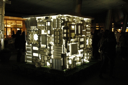
“On the rare occasions I venture into Roppongi it always confirms what I think about the place: it’s full of rich people shopping and ayashii foreigners with girl(s) in tow. It’s a place of cold, pristine department stores, contrasted with glaring, depressing ‘gentlemen’s clubs’. Somewhere in this mess you get the Blue Man Group, the Mori building, a large spider sculpture…and Super Deluxe.
“So, I was a little cynical about Roppongi Art Night. Would it just be a cheesy corporate occasion? Would it just be ignored by folks heading to night clubs? Indeed, the critics would be quick to point out that the art works haphazardly on display were meaningless, that more thought had gone into how best to achieve a light effect than in creating an interesting art work. The whole thing was simply a series of keitai snap-shot opportunities for youngsters on dates.
“Well, perhaps they would be right. But for me it did not detract from the enormous, positive energy I felt navigating the Mori complex and stumbling upon weird goodies. All the works were exciting, visually arresting (and yes, achieved for the most part by light effects). The overall idea seemed to be to make as strange a playground as possible and to put things in unlikely spots, to do things you didn’t think possible.”
William Andrews via Tokyo Art Beat
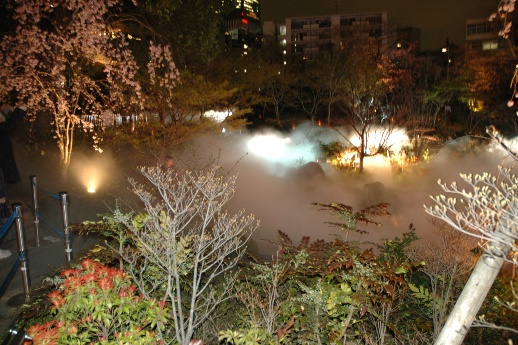
Fujiko Nakaya’s “Fog Garden #47662” was just that: the Mori garden was shrouded in a beguiling mist. Photo: WA
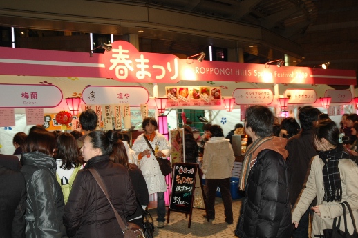
There was a matsuri-like atmosphere, with a plethora of stalls and eateries. Photo: WA
Strut and fret your hour upon the plinth
Antony Gormley on the Fourth Plinth from One & Other on Vimeo.
via Artsblog
I don’t entirely trust Anthony Gormley’s rhetoric, but I admire his handler’s scripting:
- “It’s about the democratization of art.”
- “In the end it doesn’t really matter who gets up on that thing.”
- “I’ve got an idea. You can make it real.”
Is this the end of participation? As in the logical end. The end where “it doesn’t really matter who gets up on that thing?”
Ok, ok. I’d love to strut and fret my hour upon the stage of the 4th plinth.
Other projects I might have liked to have participated in:
- Almost any Janet Cardiff project, but my first love was her Telephone Call at SFMOMA
- Carsten Holler’s Revolving Hotel Room at the Guggenheim
- rtMark’s hijacking of the Whitney Biennial was brilliant and formative
- Paul Sermon’s telematic projects: remarkably embodied for such “primitive” technology
- To have my picture snapped on Monica Studer & Christoph van den Berg’s Package Holiday
What about you?
LED fireworks
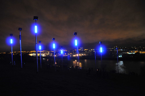
“Flash @ Hebburn by Charles Quick launched March 7, 2009. While the title is not the catchiest in the world, the image did catch my eye, and the backstory is interesting.
During the course of his research, Quick found out that during the heyday of the city of Hebburn, if you looked across the Tyne river, where the site is located, it would almost look like fireworks there was so much activity from arc welding at the shipyards to the Monkton Coke Works, which looked like it was on fire at night.
Quick’s final design evolved to consist of twelve 8.5 metre high columns arranged in a 3 x 4 grid with a distance of 8 metres between each column. Photovoltaic panels on the top power 1 meter high blue and white LED tubes mounted on the columns. The LEDs flash responsively to people waking by during the day and with a single 15-minute programmed sequence at night, which is evocative of Hebburn’s historical industries. 8 different flash sequences were designed with local Hebburn groups and are visible from across the river as far as Newcastle, Gateshead and Wallsend.
I haven’t been able to find any good video of the project, but there are photographs, background information, and an interview with the artist here.
Links
Photo gallery including historic photos of Hebburn and interview with artist Charles Quick via southyneside.info
flickr photoset
Curly’s Corner Shop, the blog!
Public art for public transport
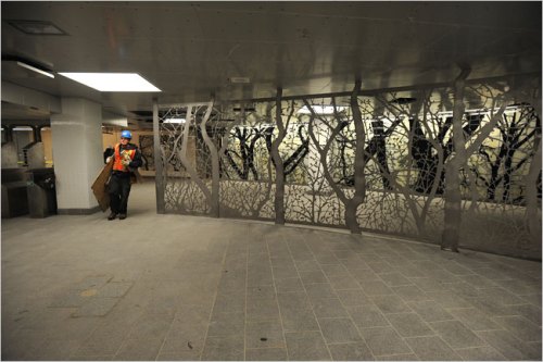
via Visualingual
Mike and Doug Starn’s See It Split, See It Change opened with the NYC South Ferry in January. From the entrance, a 20-foot wide, floor-to-ceiling marble mosaic map of the island of Manhattan extends down the stairs to the platform, inspired by an 1886 map of the tip of Manhattan from the United States Census Bureau. Curved floor-to-ceiling glass walls laced with silhouettes based on photographs of nearby Battery Park trees line the concourse. The installation is made from 425 glass panels that measure 14″ by 28″ each and includes many additional components.
Additional links
Caroline Cole, “See it Split, See it Change, and See it All for the Price of a Subway Ticket,” Metropolismag.com
Melena Ryzik, “Making Artistic Connections at a Subway Station,” NYT
Oliver Schwaner-Albright, “The New South Ferry Terminal: See It Split, See It Change,” Coolhunting
Miranda Siegel, “A Forest in the Subway,” New York Magazine
Starn Studio
Visualingual
See also
Behind Your Eye: Doug and Mike Starn via absolutearts
Uplifting art
ID?
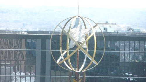
Does anybody know what this is?
Take from the 40th floor of the Wells Fargo Center in Minneapolis, facing east.


