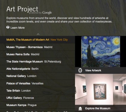
Yesterday Google released Google Art Project and today it has been garnering a lot of online buzz. The basic premise is that using Google’s Street View Technology users can navigate through the galleries and corridors of 17 different arts institutions, look at high resolution images of over 1000 featured works, and create their own collections that can be shared with friends. Most of the response is positive, incredibly so, and I even read one post on Forbes.com claiming that “this project is bringing ‘mojo’ back to google.”
Really? I must admit that I have been on a rampage ever since I visited the site.
What immediately struck me about this project is how fixated it is on perpetuating the experience of the traditional museum with walls. If Google is going to claim that their goal is to empower people to discover art, then they have truly missed an opportunity to reshape and redefine how people experience visual information online in more creative and constructive ways. Do you need to know to take two lefts in the gallery to experience the Van Gogh’s Starry Night? Why impose physical limitations on the Internet? Why propagate old paradigms when you can create new ones?
Some additional thoughts:
1 First of all, I take issue with the project name—Google Art Project. Yes, it is a project that has to do with art. And yes, it creates a network of access to globally located artworks that people should have the chance to experience. But let’s be clear, it’s a cataloging and preservation project, not an art project. To me, this project fits more along the lines of Google’s book scanning efforts.
2 By using museum floorplans, corridors, and hallways as the structure with which users view the artworks, the implication is that the institution surroundings are as important as the work of art. This is archaic. The Internet has no use for walls.
3 The “project” reinforces old models of viewership, curatorial selection, and experiencing art. Google selected very traditional institutions for this project, and those institutions selected very traditional artworks to feature individually. Therefore, under the guise of giving users the freedom to navigate through space, the project allows someone else (aka the expert) to select which works are worthy of additional study. I found this particularly frustrating while navigating through the Museum Kampa in Prague, an institution unfamiliar to me. In a few galleries I saw video works being displayed on monitors, but wasn’t able to learn more, zoom in, or even to get a clear image (even though they weren’t purposely blurred out like other works with copyright issues). Or in the case of MOMA, selections are limited to works by well known (and very dead) artists such as Cezanne, Seurat, Van Gogh, and Picasso. Where are the modernist and contemporary artists (slight props here to Tate Britain who at least selected a work by living artist Chris Ofili)? According to Google’s press release, it seems the motivation of the project was the democratization of art. Yet the project propagates a limited “best of” view of already famous paintings and sculptures. It is a very limited dialog, and in the end the viewer doesn’t get the full picture of the collections that they claim to portray. Democratization needs to include participation.
4 Similarly, the “project” clearly reinforces the traditional museum perspective of which mediums of works are more likely to be supported (painting and sculpture). There are very clear limits to the approach they are taking in documentation and those limitations are not noted or addressed anywhere within the application. How would this same “Google Street View” model be applied to time-based art? Video? Installation?
5 The project would be far stronger if Google were open to creating dialog around their project and their process. Even when their FAQ asks “How can I get my museum added to the project?” it receives the closed reply: “Please check back here for more news soon on new museums being added to the project.” There is clearly no opportunity for user or non-invited contributions to be included.
I’d like to ask what are more forward-looking online models for sharing and experiencing art? There are certainly many interesting examples of user generated archives and navigable museum collections out there. One recent example is Lynn Hershman Leeson’s RAW/WAR archive that invites users to contribute to the decades worth of images and video in Hershman’s !Women Art Revolution Collection, a publicly accessible online archive housed at Stanford University.
I admire their resources, believe there are valid aspects to the project (although bristle at the articulation of the project goals), and trust that any exposure to the arts carries huge benefits, but feel a need to point out that where Google Art Project misses the point is that it isn’t the experience of virtually navigating physical gallery spaces, or zooming into gigapixels to view every crack of paint that should be democratized among people and cultures—it’s the broader opportunity to experience and react to the art itself. Why put navigation in the hands of viewers if you’re going to strictly limit what they can see?
