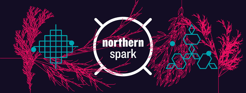
Designer Matthew Rezac on Northern Spark 2019’s graphic identity
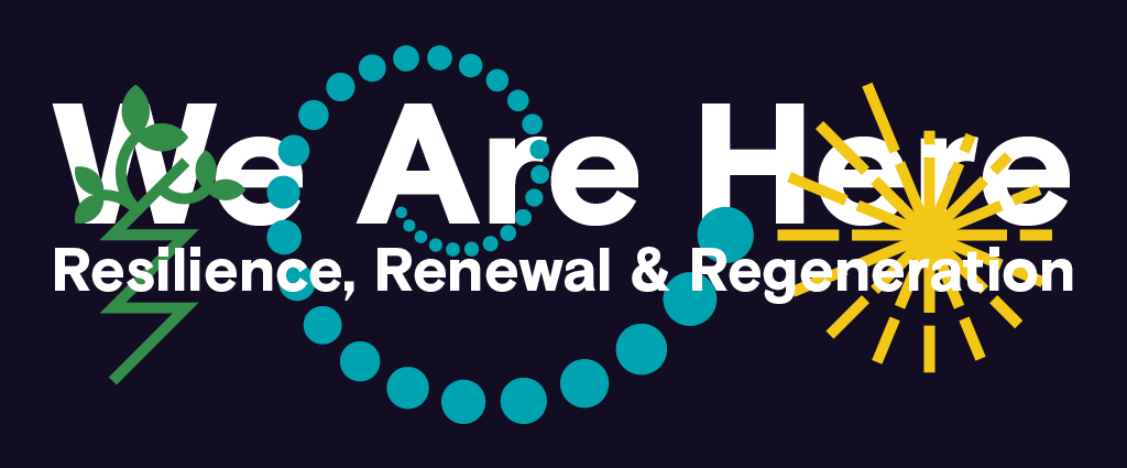
The graphic identity for Northern Spark 2019 was revealed today on the refreshed festival website. Designer Matthew Rezac, who created the original NS logo back in 2011 and has art directed the festival’s design ever since, turned this year’s rich theme, We Are Here: Resilience, Renewal & Regeneration, into a set of icons.
We asked him a few questions about his design process. Here’s what he had to say:
NL: This year’s theme has a lot of ideas packed into the title. How did you approach translating the ideas into graphics?
MR: I originally started thinking about the literal sense of “We Are Here” — such as maps and the visual language that goes along with them. However, after an informal meeting with some core Northern Lights staff it became clear that the design should come from the ideas held within the “Resilience, Renewal & Regeneration” portion of the theme. Broad symbols and ideas mentioned during that meeting were things like roots, plants/trees, growth, and cycles. The challenge then became how to present these ubiquitous themes in a unique (or at least less-common) way that also looked like Northern Spark.
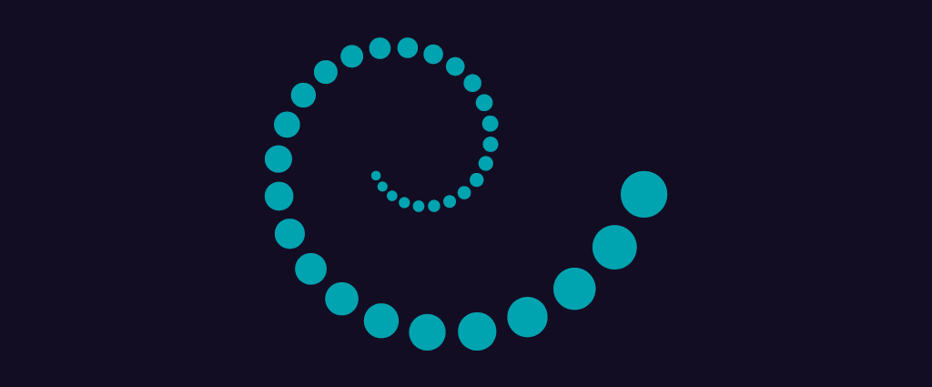
From there I took a deep dive into the world of fractals, hoping a micro view would lead me to something that a macro view could not. In the end most of the visual studies related to fractals ended up on the cutting-room floor, but that process lead me to the spiral graphic. I was thinking about the simplest graphic representation of “growth,” each circle being larger than the previous. In those early sketches I liked how the spiral interplayed with the Northern Spark logo — and how it could also be a representation of “renewal” — so I set off to create visuals for “resilience” and “regeneration.”
For “resilience” I kept thinking about “defiant growth” and specifically how you often see grass/weeds/plants growing out of the cracks in a concrete sidewalk. The extreme angles in the crack portion of the icon gives the whole thing a defiant feeling — like it could be the symbol for a resistance movement.

Then, for “regeneration” I went the direct biological route, thinking about things in nature that can regenerate tissue or limbs. The resulting symbol is a more abstract shape that has been cut in a circle, with the new pieces along the outer edge growing in a clockwise pattern — each line longer than the previous.

Finally, the way the three icons interact with the typography is once again referencing the idea of “defiant growth” as the icons move from the background to the foreground, growing around the type.
NL: Did you have any design ideas that didn’t make the cut that you love?
MR: There was one direction (from my fractal deep-dive) that was using a script to draw various fractal trees. I was determined to make it work, but in the end it just wasn’t right. It felt too flat from a conceptual standpoint. It was also problematic visually: it looked great for social media headers, but fell apart when I put it on t-shirts or the website.
NL: The design for Northern Spark has always been about icons. You’ve recently looked through the entire catalog of NS icons to prepare the graphics for the upcoming Spring Howl fundraiser. What are your favorites? Or is that like asking which kid you like best?
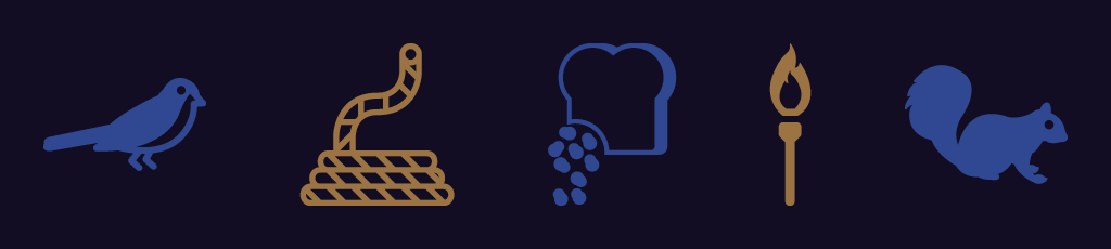
MR: From the first set I designed in 2011, I am partial to the bird for some reason. Actually, there are quite a few from that original set that aren’t directly related to Northern Spark programming or activities — bird, squirrel, bread crumbs, etc. I just tried to have a little extra fun with those flourishes on the periphery.
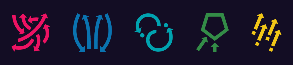
I also still love the 2016 Climate Chaos system of arrows. Expressing five different concepts (move, nourish, interconnect, perceive, act) using one device (the arrow) was such an efficient move, both visually and conceptually. And they looked amazing on the t-shirt!
NL: Lastly, what else are you working on that inspires you these days?
MR: I’m currently working on a number of exciting and inspiring art books, each in a different phase of development — two of these are in the very early stages, but also have Northern Spark connections. One is a new collaborative artist book with Monica Haller (who presented at Northern Spark in 2013 and 2016). Monica and I had previously collaborated on the book “Riley and his story” (2009), and the creative process surrounding her new work has been invigorating — I’m really excited to see where this one takes us. The second connection is an exhibition catalog for Piotr Szyhalski (who has been a part of Northern Spark in some way or another more often than not). I’ve been a huge fan of Piotr’s work since I was a student at MCAD, so working on that one is a complete honor.